
Elm Remuera Sub-Penthouse
Portfolio Grade9.1/10
strong focal hierarchy, clear subject, balanced composition, strong camera position, compositional depth, balanced lighting, photographic exposure, material realism
Demo Review
See how Final01 analyses, scores and provides structured, professional feedback to elevate a render from commercial-ready to portfolio-grade.
Revision comparison
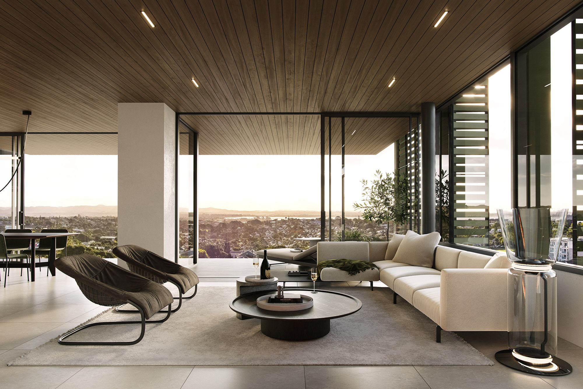
The review below is for the Original render. The Revised render is shown for comparison only.
Overall Score
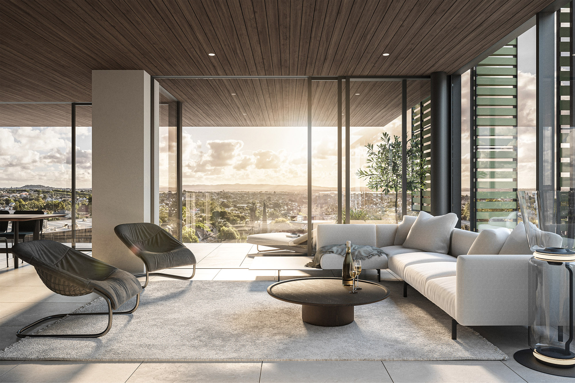
Strong commercial interior render with an attractive architectural shell, expansive glazing and a warm sunset atmosphere, but the image still falls short of portfolio-grade due to several important art-direction weaknesses. The composition feels slightly cramped and overly wide in the foreground living zone, perspective distortion exaggerates the furniture arrangement, and the harsh sunlight treatment reduces realism and subtlety. Furniture styling is generally cohesive but spatial relationships within the seating area feel loose and slightly unresolved. Materials and mood are competent overall, however the image would benefit from stronger hierarchy, softer lighting control and more refined staging to achieve a genuinely premium photographic result.
Room Type
Living
Interior Context
Private Residential
Camera Type
Square On
Composition & Camera
6.8 / 10
Lighting
6.7 / 10
Materials & Geometry
7.1 / 10
Furniture & Styling
6.6 / 10
Realism & CG Artefacts
6.8 / 10
Narrative & Mood
7 / 10
Issue: The framing feels slightly cramped and overly wide-angle in the foreground living arrangement. Perspective exaggeration on the rug and seating makes the space feel more CGI and reduces architectural elegance. Important furniture pieces are cropped awkwardly at the frame edges.
Recommendation: Move the camera slightly backward and use a subtly narrower focal length to reduce foreground distortion and improve proportional balance. Reveal slightly more of the connected dining space to the left and allow additional breathing room around the sofa and floor lamp.
Impact: High — immediately improves realism, spatial clarity and compositional sophistication while making the apartment feel larger and more architecturally resolved.
The current perspective pushes the foreground too aggressively toward the viewer and weakens the calm, premium atmosphere expected of high-end residential imagery.
Issue: The lighting relies on strong direct sunlight and visible flare behaviour which feels overly stylised and slightly artificial. Highlights clip aggressively and reduce material readability across the seating and glazing.
Recommendation: Soften the sun into a broader directional glow with gentler transitions and reduced specular harshness. Remove the flare effect entirely and allow the lighting to create depth through contrast and atmosphere rather than lens artefacts.
Impact: High — creates a more believable luxury mood, improves material realism and allows the architecture to feel more refined and expensive.
The current sunlight treatment feels more like CGI spectacle than premium architectural photography.
Issue: The seating layout feels slightly disconnected, with awkward spacing between the armchairs and coffee table weakening the focal hierarchy and conversation zone.
Recommendation: Move the armchairs inward, tighten the grouping around the coffee table and ensure all primary seating elements sit fully and intentionally within the rug boundary. Square the chairs toward the conversation zone to reinforce spatial cohesion.
Impact: High — improves flow, balance and perceived luxury while making the living arrangement feel intentionally designed rather than loosely staged.
Small spacing inconsistencies in premium interiors are highly noticeable and strongly affect perceived sophistication.
Issue: The grading is slightly flat through the midtones and shadow regions, reducing depth and visual layering within the interior shell.
Recommendation: Introduce deeper shadow density and slightly richer tonal separation while preserving soft highlight rolloff. Allow darker architectural elements and recessed zones to anchor the image more strongly against the bright exterior.
Impact: Medium — improves spatial depth, cinematic quality and architectural readability without changing the overall mood.
The current tonal balance slightly washes the space and reduces perceived richness.
Issue: The bright white seating and rug feel slightly cool and disconnected from the warm golden-hour lighting environment.
Recommendation: Shift the upholstery and rug subtly toward warmer cream/off-white values so the materials respond more naturally to the sunset lighting and timber ceiling tones.
Impact: Medium — improves colour harmony and makes the interior feel more cohesive and premium.
Warm-neutral balancing is a subtle but important technique in high-end sunset interiors.
Issue: The coffee table arrangement feels slightly sparse and under-resolved relative to the quality of the architecture.
Recommendation: Add a curated tray arrangement with restrained luxury accessories to create layered detail and improve the sense of intentional styling. Keep objects minimal and compositionally balanced.
Impact: Low–Medium — adds refinement and tactile realism while improving the premium residential mood.
The centrepiece currently lacks enough visual weight to properly anchor the seating composition.
This is already a strong commercial interior with excellent architecture, expansive glazing and an appealing sunset atmosphere, but the image currently leans slightly too heavily into wide-angle CGI aesthetics and stylised lighting. The biggest opportunity is to calm the image down and make it feel more photographic. Pulling the camera back, reducing perspective exaggeration and softening the sunlight treatment would immediately elevate the render into a more premium visual language. The living arrangement also needs tighter spatial relationships to properly define the seating zone and strengthen hierarchy. After those larger art-direction adjustments, focus on tonal depth, warmer material balancing and more layered styling detail to move the image from polished commercial CGI toward genuinely refined architectural imagery.
Visual References
These references are selected from the Final01 visual library to help clarify the standard of composition, lighting, realism and restraint the review is calibrated against.
Try Final01
Upload your render and receive structured professional review feedback in seconds.

