
Ayr Residences Front Court
Portfolio Grade9.2/10
strong focal hierarchy, clear subject, balanced composition, strong camera position, compositional depth, balanced lighting, photographic exposure, material realism
Demo Review
See how Final01 analyses, scores and provides structured, professional feedback to elevate a render from commercial-ready to portfolio-grade.
Revision comparison
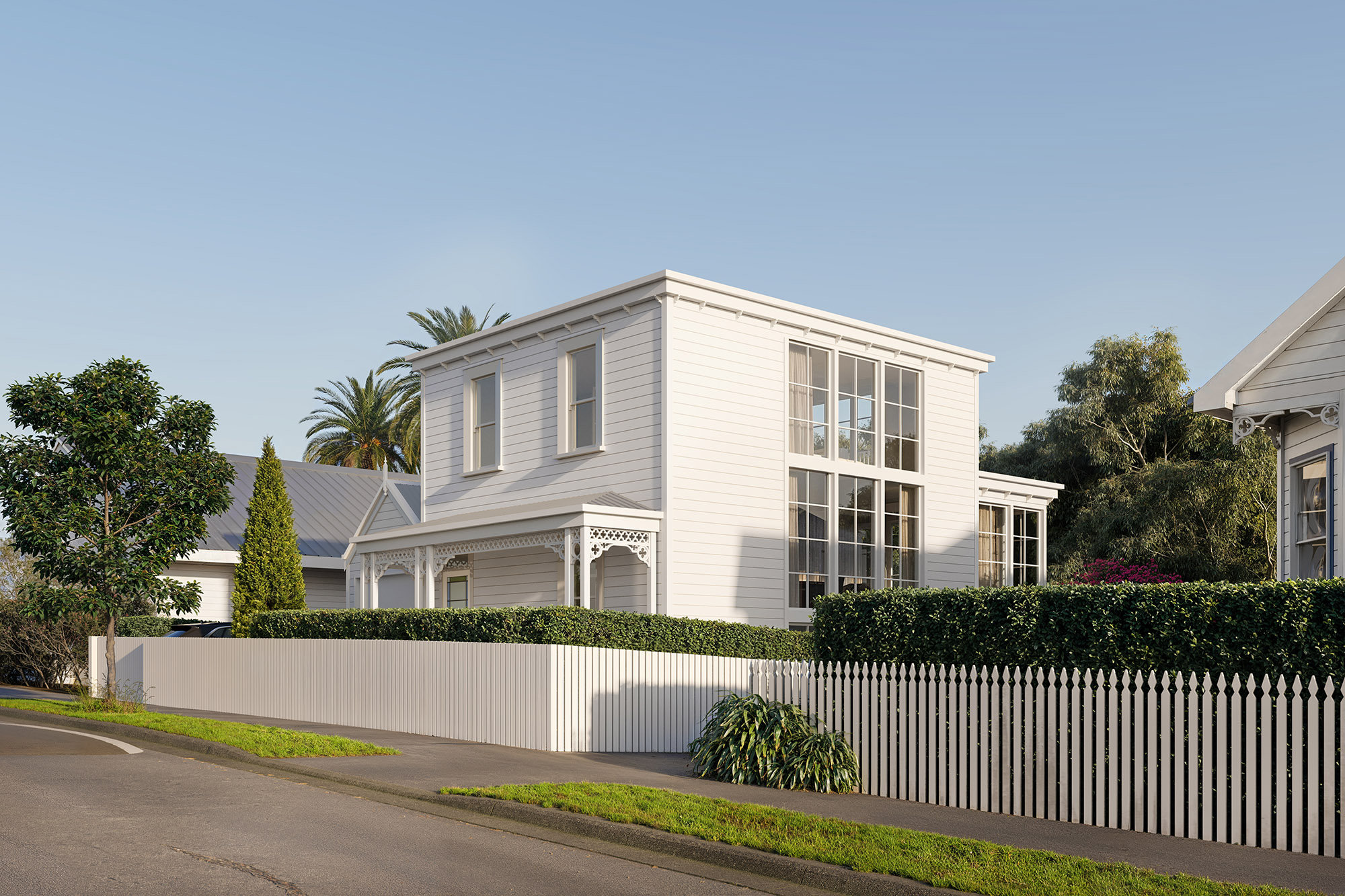
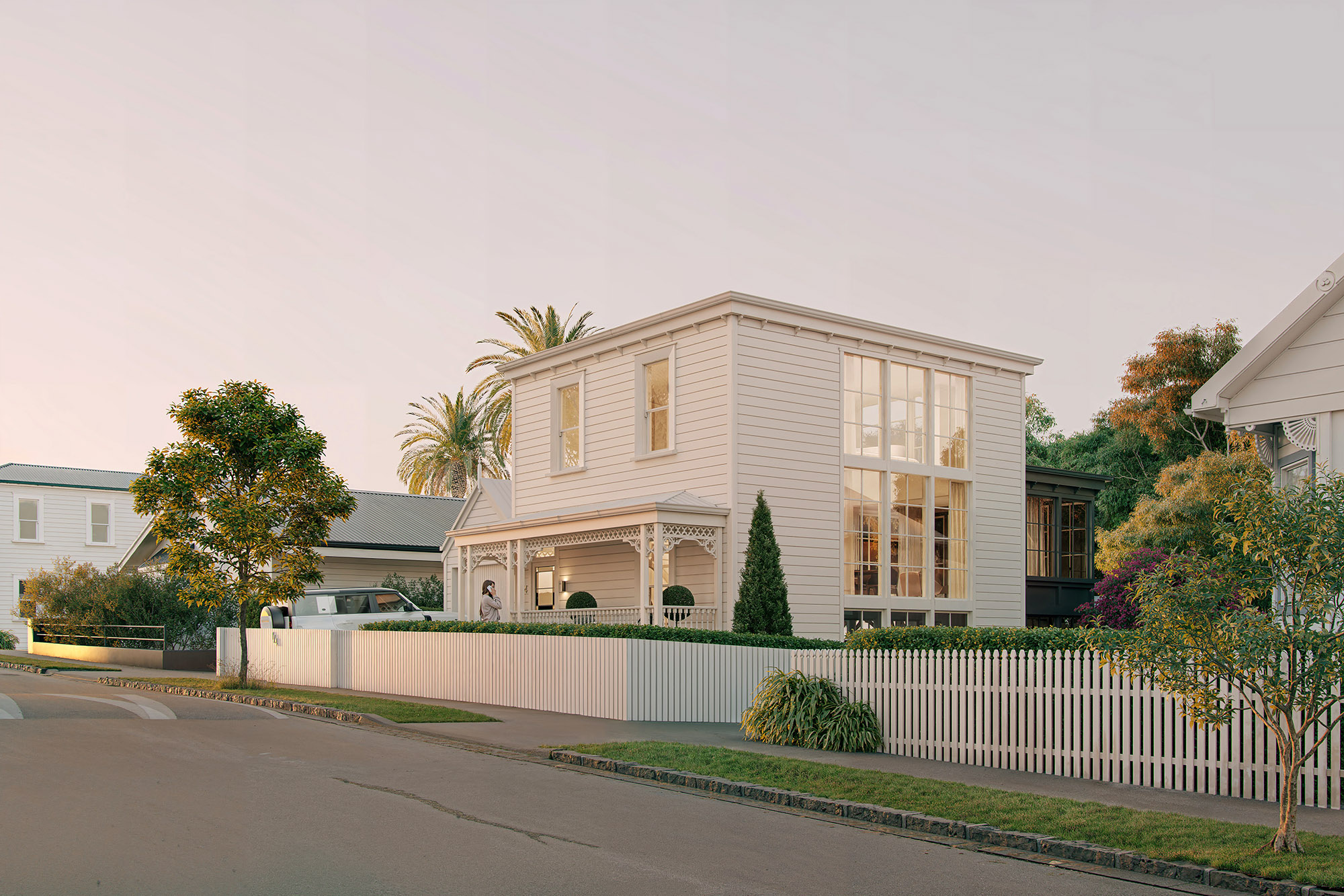
The review below is for the Original render. The Revised render is shown for comparison only.
Overall Score
A strong commercial exterior render with convincing material execution, refined landscaping and an elegant architectural palette, but the image lacks a clear visual hierarchy and emotional lighting direction. The composition currently feels slightly static and diagrammatic due to the centred leading edge and broad, front-lit daylight scenario, which flattens the architecture and reduces depth. While technically polished and commercially usable, the image would benefit from stronger focal emphasis, more atmospheric lighting, and improved foreground layering to elevate it from clean architectural documentation toward a more memorable portfolio-quality streetscape.
Development Type
Standalone House
Lighting Type
Daylight
Camera Type
Hero
Composition & Camera
6.7 / 10
Lighting
6.6 / 10
Materials & Geometry
7.8 / 10
Landscaping & Context
7.5 / 10
Realism & CG Artefacts
7.2 / 10
Narrative & Mood
6.4 / 10
Issue: The camera currently sits close to a 45-degree architectural angle with the building corner positioned near the centre of frame, creating a static, diagrammatic composition rather than a more photographic streetscape hierarchy.
Recommendation: Move the camera slightly back and use a marginally narrower lens to compress the perspective and reduce distortion. Rotate the camera target subtly left so the leading edge shifts away from the centre of frame and the composition feels more naturally weighted. Allow the façade and verandah sequence to read more progressively across the image rather than symmetrically splitting the frame.
Impact: High — Creates a more sophisticated photographic composition, improves visual flow through the architecture, and reduces the “architectural elevation” feeling currently present.
The current framing is technically clean but overly balanced around the corner condition, which weakens hierarchy and makes the image feel more descriptive than cinematic.
Issue: The image lacks a singular focal moment; the viewer’s eye moves broadly across façade, landscaping and glazing without a strong destination.
Recommendation: Lower the front hedge height slightly around the entry sequence and introduce a subtle human moment — such as a person approaching or entering the verandah — to direct attention toward the front door. Allow the verandah and entry to become the emotional anchor of the composition rather than the overall building mass alone.
Impact: High - Strengthens hierarchy, improves narrative clarity and increases emotional engagement with the architecture.
High-end residential streetscapes typically establish a clear human-scaled focal point rather than relying solely on architectural massing.
Issue: The current daylight lighting direction originates largely from behind the camera, washing both façades evenly and flattening form, depth and material articulation.
Recommendation: Explore a lower-angle golden hour or dusk lighting setup with directional side light striking the façade more selectively. Allow the interiors to glow warmly through the large glazing while increasing contrast between lit and shaded surfaces. Introduce longer shadows and warmer tonal separation to sculpt architectural depth.
Impact: High - Substantially improves atmosphere, dimensionality, mood and premium emotional appeal while creating stronger separation between architecture and surroundings.
The render is technically polished but emotionally restrained; lighting is currently the main factor preventing the image from feeling cinematic or portfolio-grade.
Issue: The right side of the frame currently ends quite openly, reducing foreground layering and photographic depth.
Recommendation: Introduce a restrained foreground tree, planting element or partial foliage overlap on the right edge to help frame the architecture and create additional spatial layering.
Impact: Medium — Adds depth, improves immersion and helps the image feel more naturally photographed rather than fully exposed.
Issue: The grass saturation feels slightly electric in places and the tonal variation across the lawn introduces some muddy colour patches.
Recommendation: Desaturate the grass slightly and unify the lawn grading toward a calmer, more natural green palette with softer tonal transitions.
Impact: Medium — Improves realism and reinforces the restrained, premium material palette of the overall image.
This is a polished and commercially strong exterior with excellent architectural fundamentals, refined landscaping and believable material execution. The next step is less about adding detail and more about introducing hierarchy, atmosphere and cinematic intent. Focus on creating a stronger emotional anchor through lighting and entry emphasis rather than treating the entire façade with equal importance. A more directional golden-hour or dusk scenario would immediately improve depth and help the interiors contribute meaningfully to the composition. Reframing the camera slightly and introducing subtle foreground layering will further shift the image from clean architectural documentation toward a more sophisticated editorial streetscape.
Visual References
These references are selected from the Final01 visual library to help clarify the standard of composition, lighting, realism and restraint the review is calibrated against.
Try Final01
Upload your render and receive structured professional review feedback in seconds.

